Since 2018, The Soap Box Press has published a series of chapbooks. Chosen from a pool of submissions, the chapbooks all feature a collection of poetry on unique themes from different poets. The challenge when it comes to developing cover artwork for these chapbooks is creating a graphic that represents the individual work while adhering to the specific series’ aesthetic. Chapbooks are selected throughout the year, so developing an aesthetic that is powerful, bold, and flexible enough so it can work for a publication that has yet to be decided upon is key during the planning stages of each series.
Throat on Fire, The Soap Box Press 2020 Chapbook {Cover, Typesetting, and eBook}

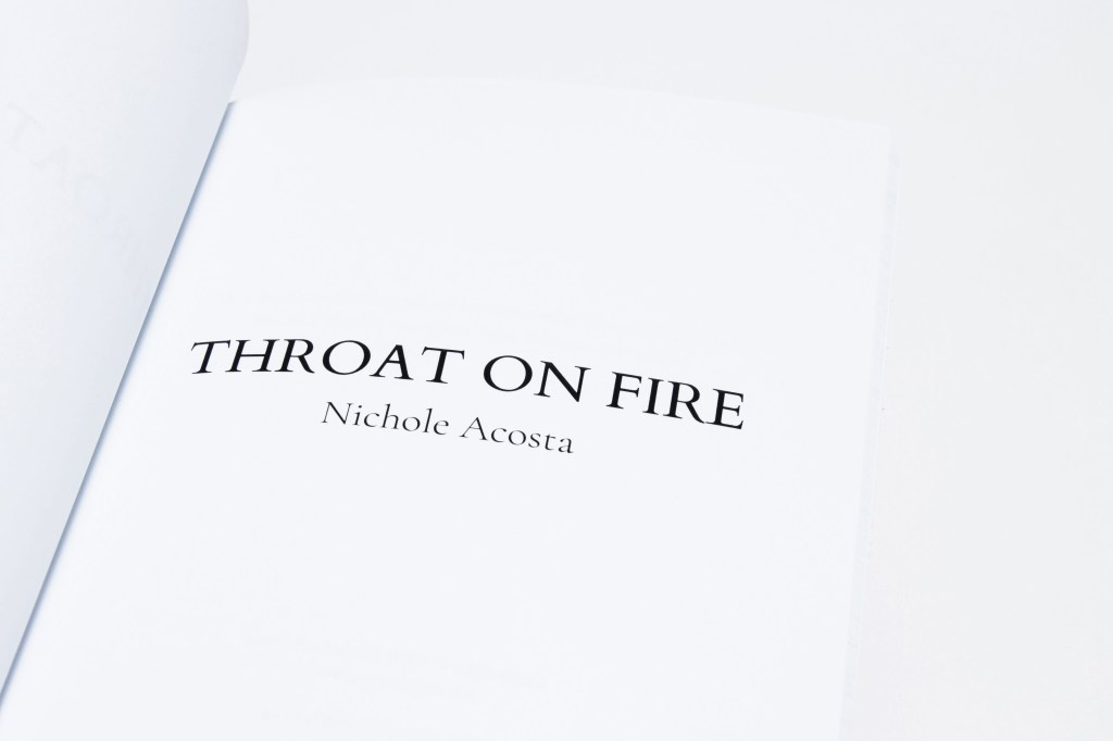
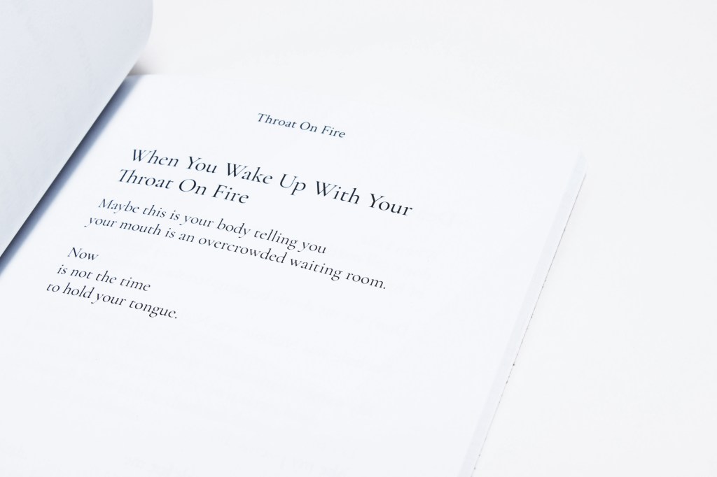
Throat on Fire by Nichole Acosta is the first chapbook of the 2020 series and is also the first chapbook from The Soap Box Press that I had the opportunity to typeset and create the eBook version of. There were multiple ideas for this cover and a spectrum of colours considered, especially after the collection received a name change.
One thing I love about developing art is the subjectivity of its meaning between individuals. Nichole mentioned that the final colour scheme reminded her of a Chinese New Year red packet and its symbolism of luck.
The Soap Box Press 2019 Chapbook Series {Cover Design}
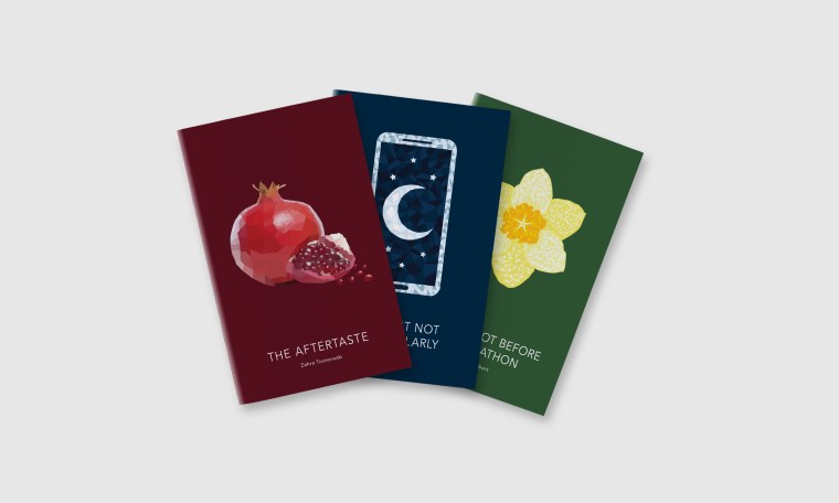
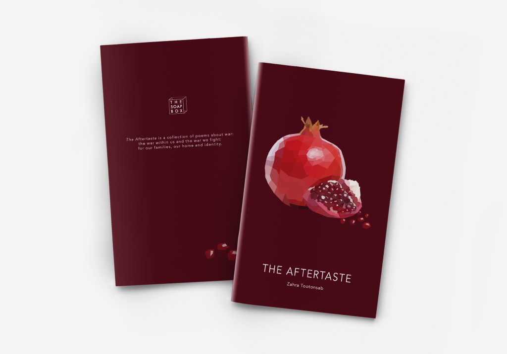
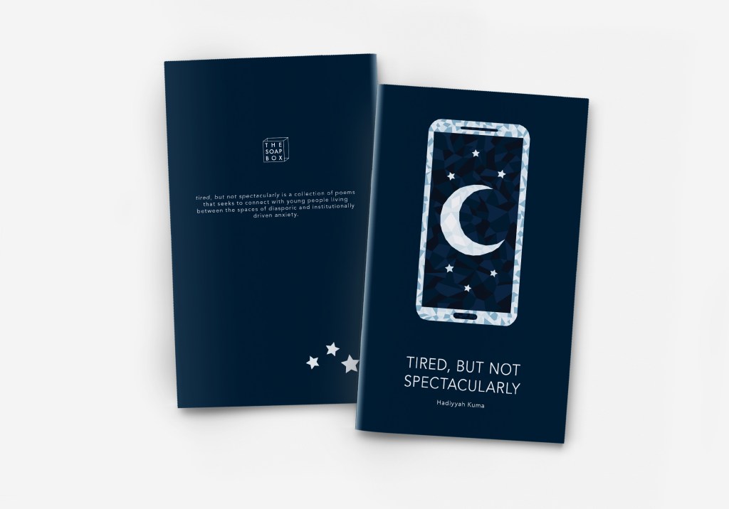
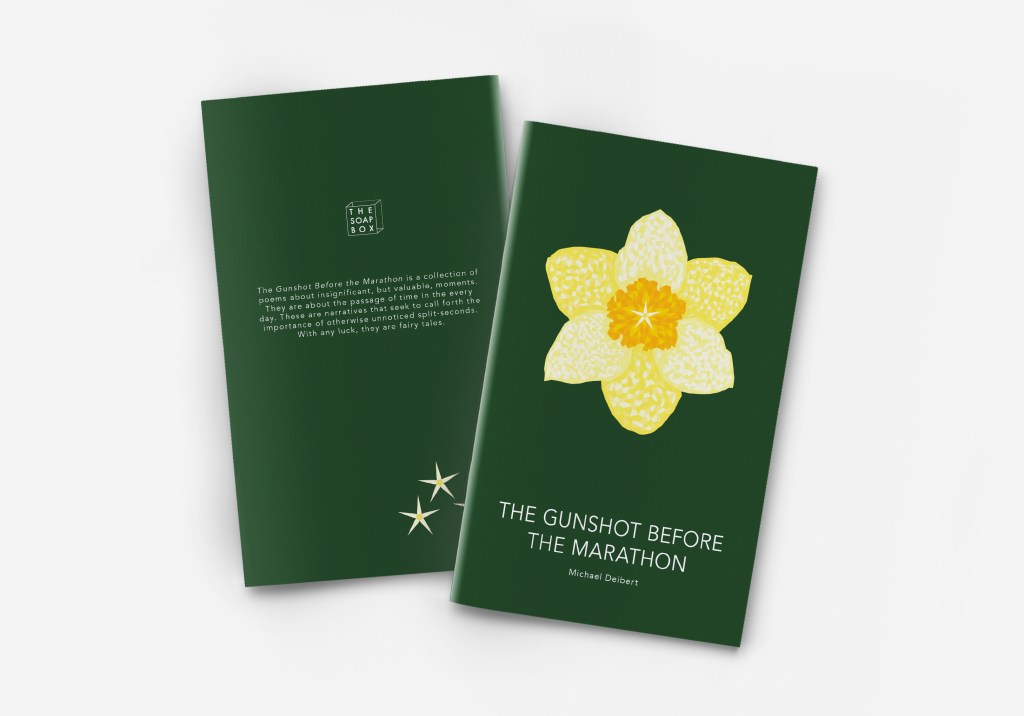
The 2019 Chapbook collection’s cover artwork is entirely digital with no traditional elements. Each cover design features a mosaic inspired design using polygons in various colours to create a design that reflects its respective publication. On the back cover of each publication is an additional illustrative element, carrying the theme of the chapbook across the publication from cover to cover.
The Soap Box Press 2018 Chapbook Series {Cover Design}

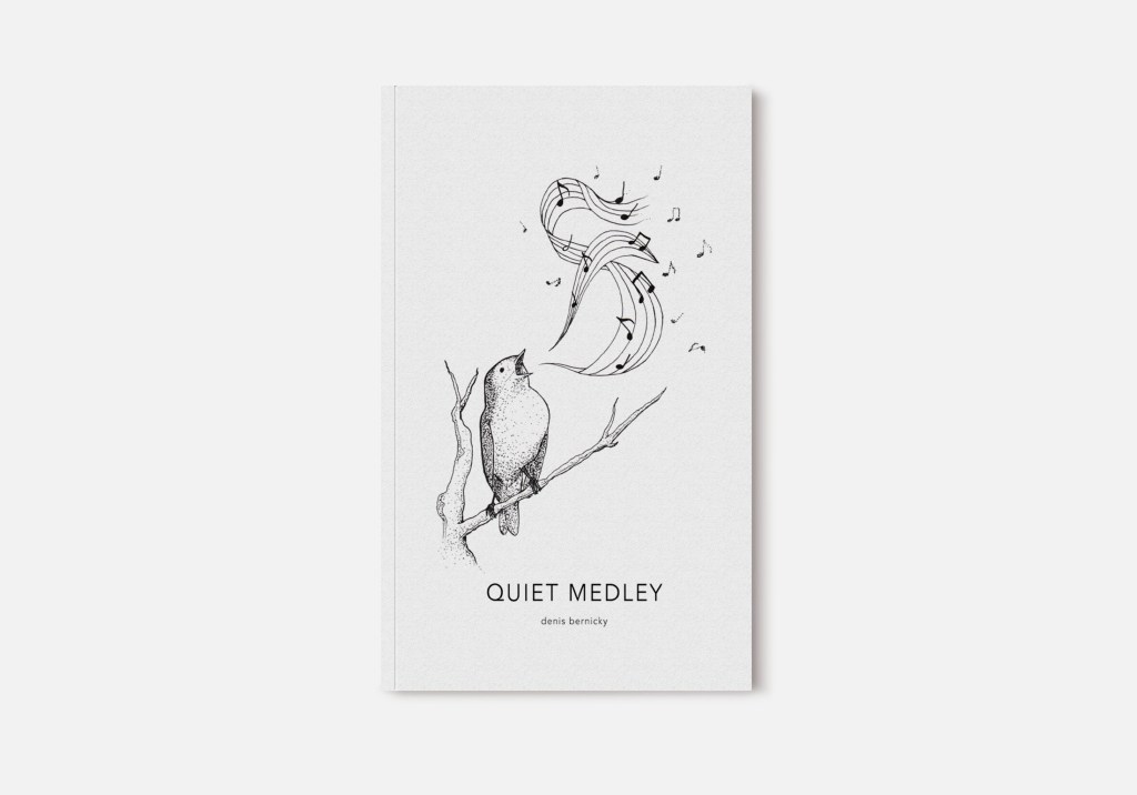
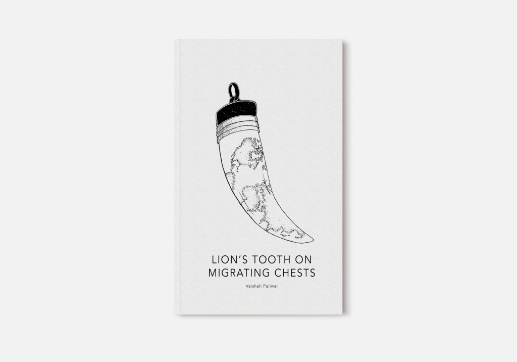
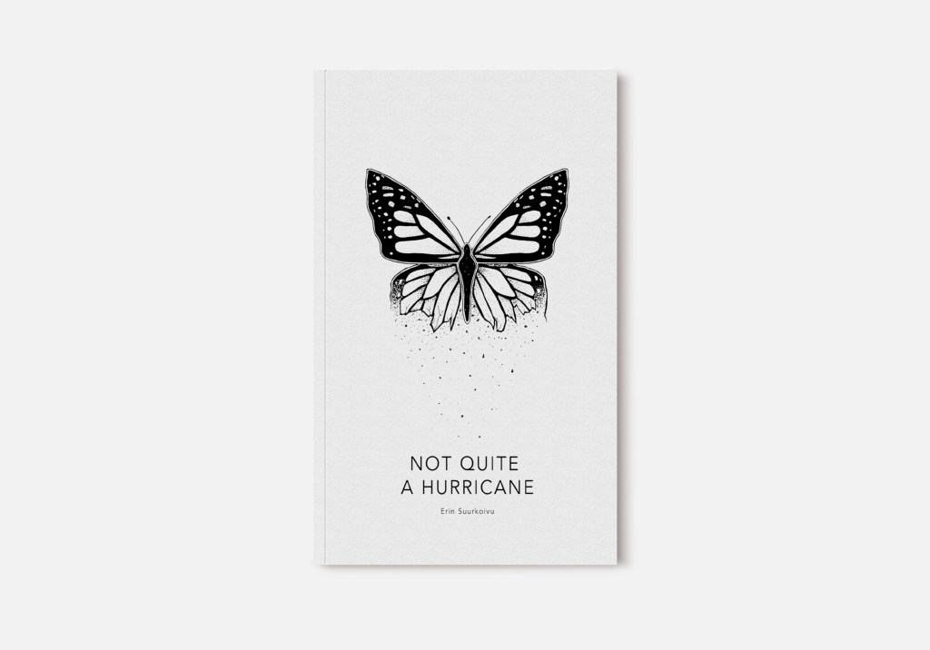
The artwork in this series is a blend of traditional pen illustration in a pseudo pointillism style and digital manipulation for various elements and touch-ups. On the back cover of each publication (not pictured) is an additional illustrative element, carrying the theme of the chapbook across the publication from cover to cover. This was originally to have an element in place of a barcode, but has since become a staple of The Soap Box Press’s chapbook design.

Leave a comment